How We Turned a Pharmacy Website into a Refill Power Tool
Patients stopped calling. Staff stopped stressing. Refills now happen with zero confusion —
starting with one input field.
My Role
UX Designer
Team
With Santosh Panyala (Design Engineer)
Timeline
~8 weeks
Platform
Web · Figma · Next.js · React
Users
Patients + Pharmacy Staff
ULTRACARE
PHARMACY — REFILL TRACKER
Rx #48201 Ready for Pickup
Patients check status in under 10 seconds. No call
needed.
💡 Background
Why This Project Happened
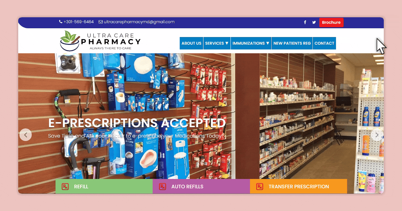
Ultracare Pharmacy had a website — but it was mostly informational. Patients couldn't check anything. Staff
were fielding the same refill questions 20+ times a day. The moment of clarity came from a pharmacist:
"Patients keep calling just to ask if their refill is ready."
This wasn't just a redesign — it was a rethink. The goal: turn the site into a tool that actually helps.
🤕
Who Was Affected
Patients dealing with uncertainty and unnecessary calls. Staff drowning in repetitive
manual updates.
⚠️
Why It Mattered
The old site wasn't scalable, added stress across the board, and offered no self-service
path.
🔍 Research & Validation
Understanding the Real Problem
I led user research — interviewing pharmacy staff, reviewing support call patterns, and analyzing what users
were typing into the old contact form.
Insight 01
No login, please
Patients don't want accounts. They just want to check a number.
Any friction kills adoption.
Insight 02
Vague status = anxiety
Generic labels like "In Progress" increase call volume.
Specific language builds trust.
Insight 03
Staff repetition is the bottleneck
The same 3–4 updates were being communicated manually all day.
Self-service was the answer.
"They just want to know if it's ready or not."
— Pharmacist, Ultracare
⚡ Strategy
Design Hypotheses
Idea 01
Surface the input immediately
If the Rx field is front and center, patients will self-serve
instead of calling.
Idea 02
Explain every status clearly
Specific, human-readable statuses increase trust and decrease
anxiety.
Idea 03
Remove all login gates
No account required → barrier drops → adoption rises naturally.
🛠️ The Solution
Designing for Real People, Not Edge Cases
Every screen had to reduce confusion, not just look nice. Patients were stressed. Phones were ringing.
Self-service needed to feel human, fast, and trustworthy.
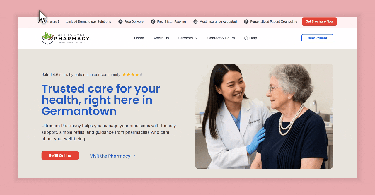
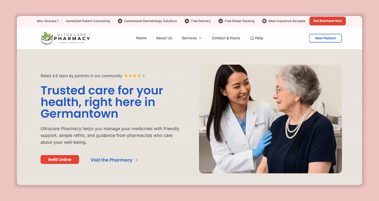
Feature 01 — ✅ One field. Zero friction.
Rx Entry on Homepage
No login. No confusion. Just type your Rx number and track. I designed the entry state to be the hero —
removing every barrier to self-service.
Centered input, clear placeholder, single CTA. Nothing competing
for attention.
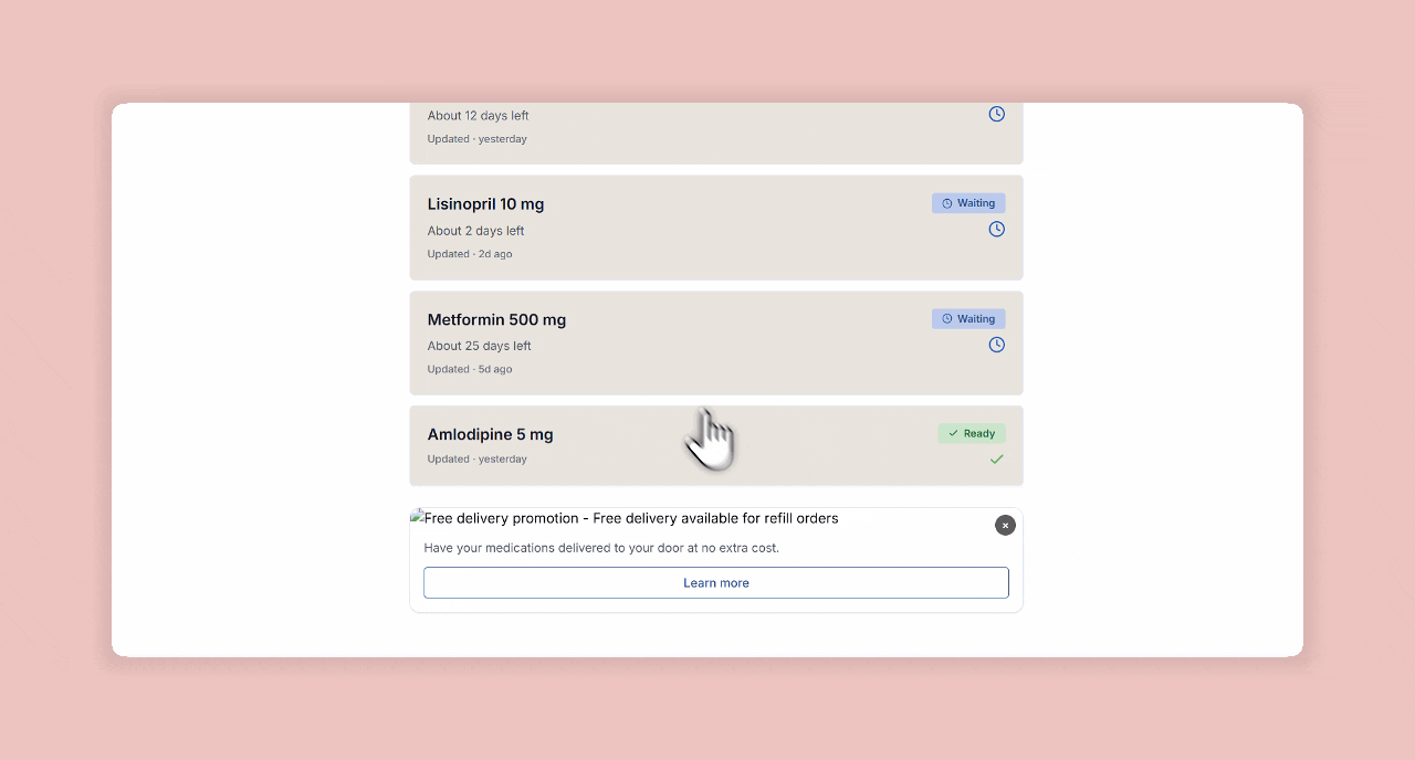
Feature 02 — ✅ Clear status for peace of mind.
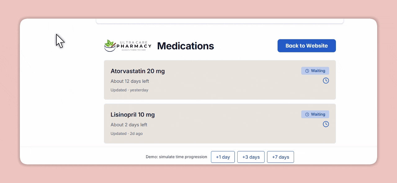
Refill Tracker with Real-Time Status
From "Waiting for Doctor" to "Ready for Pickup" — each status is specific, calm, and instructive. No
generic "In Progress".
Every label mimics what a trusted pharmacist would say.
Feature 03 — ✅ Microcopy that replaces a phone call.
UI Language Designed for Empathy
I wrote and tested multiple copy variants. "Waiting on your doctor's approval" beats "Still processing"
every time.
Icons and soft tones reduce anxiety; success states build trust.
🔄 Transformation
Before vs After: Homepage + Tracker
We transformed a passive brochure site into a responsive product tool.
After
Before
Before (Old Site)
After (New Tool)
🤝 Constraints & Collaboration
Designing in the Real World
⚖️ Regulatory
No user accounts — HIPAA-sensitive flow
Zero PII storage; Rx for transient queries only
Required precise copy + intuitive fallback states
🔧 Technical
Backend not built for real-time status
No sandbox — staged live data on dev branch
Prototype first to test language + error states
🧑🤝🧑 Collaboration
Mapped pharmacy workflows to digital steps
Worked with engineers on lookup + status mapping
Aligned scope with PM for 6-week launch
📐 UX Under Pressure
Anxious patients — language was everything
Every fallback had to feel reassuring, not alarming
Mobile-first from day one
🚀 Impact
Real-World Results
64%
drop in refill-related support calls
<10s
average time to check refill status
90%
of demo testers completed without error
"Patients are finally using the site for something useful."
— Pharmacy Tech, Ultracare
✨ Reflection
What I Learned
Clarity matters more than speed in healthcare UX — patients need to feel informed, not just served fast.
UI can replace phone support entirely if the language is human and the flow removes every unnecessary step.
Regulatory constraints force precision — not less creativity.
Testing copy variants is as important as testing visual hierarchy. The right words reduce anxiety more than
any color can.
Across 4 pharmacy locations, delivery staff were manually creating each label one by one — pulling patient info
from Nimble payment PDFs and typing it into Falcon. At 1–1.5 minutes per label and 200–250 deliveries a day,
this was consuming hours of staff time daily.
Wrong addresses were slipping through. No validation, no duplicate detection, no consistency across locations.
I saw the inefficiency and took full ownership of fixing it.
❌ Before
~1–1.5 min
per label, typed manually from PDF — across 200+ deliveries every day
✅ After
~5 min
for the entire batch — automated, validated, and ready to print in Falcon
🛠️ The System I Built
A Fully Automated Label Pipeline
I designed and built the entire automation in n8n — connecting Nimble, Google Drive, and Falcon into a single
reliable pipeline that runs every day without anyone triggering it.
Nimble PDFsPayment data
→
Synced DriveAuto-ingested
→
n8n WorkflowParse + validate
→
FalconLabels generated
→
Staff + DriversPrint & go
⏰
Scheduled Daily Run
2:00 PM trigger in n8n — runs automatically. Plus on-demand runs for urgent orders.
📄
PDF Ingestion via Drive
Synced Drive folder auto-ingests Nimble PDFs. n8n watches the folder and picks up new
files instantly.
✅
Validation + Duplicate Detection
Address validation and duplicate detection catch errors before labels generate — the main
source of wrong-address incidents before this system.
🖨️
Label Generation in Falcon
Automated label creation directly in Falcon — formatted, consistent, ready to print. Staff
went from data entry to just hitting print.
🚀 Impact
Operational Results
1.5min → 5min
per label → per full batch of 200–250
~11%
weekly drop in wrong-address incidents
4
locations on one unified system, 6–8 staff, 4–5 drivers
✨ Reflection
What I Took Away
Owning a system end-to-end — from spotting the inefficiency to shipping the fix — is a different design
challenge, and one I genuinely enjoy.
Automation without validation is just faster failure. The checks were as important as the speed gains.
Operations staff need to trust a system before they'll stop manually verifying it. That trust is designed,
not assumed.
No-code tools like n8n can solve real business problems — the skill is understanding the workflow deeply
enough to automate it right.
Turning Raw Pharmacy Data into Actionable Dashboards
Transformed scattered spreadsheets — medicine sales, prescription volumes, and controlled
medication logs — into a unified dashboard system for pharmacy leadership.
🔒Internal project — visuals below are representative
mockups. Real data is confidential.
My Role
Data Designer / Dashboard Owner
Data Sources
Medicine sales · Prescription logs · Controlled med records
Output
Digital dashboards with live visuals for leadership
PHARMACY OPS DASHBOARD — REPRESENTATIVE MOCKUP
Live Dashboard Sales · Rx · Controlled Meds
Raw data → structured visuals → faster decisions
💡 The Problem
Data Existed. Clarity Didn't.
The pharmacy generated valuable data every day — medicine sales, prescription counts per doctor, and controlled
medication logs (purchased vs. dispensed). But all of it lived in raw form: spreadsheets, manual logs,
disconnected files.
Leadership had no quick way to spot trends, flag discrepancies, or make decisions without digging through rows
of numbers. I was brought in to change that.
📊
The Raw Data
Medicine sales, doctor-level prescription counts, and
controlled med purchase/dispense logs — all unstructured and siloed.
🎯
The Goal
Build a dashboard layer that makes data readable at a glance —
right charts, right groupings, clear signals for what needs attention.
🖥️ What I Designed
Three Dashboard Views, One Unified System
I structured the data into three distinct views, each serving a different decision need. All mockups use
sanitized placeholder data.
Dashboard 01 — Medicine Sales Overview
Representative Mockup
Medicine Sales — Monthly Overview
Total Revenue
$84.2K
↑ 12% vs last month
Units Dispensed
6,340
Across all categories
Top Category
Cardiovascular
31% of total sales
Sales by Category — Last 6 Months
Top Meds by Volume
Lisinopril
882
Metformin
741
Atorvastatin
612
Amlodipine
489
Dashboard 02 — Prescription Volume by Doctor
Representative Mockup
Prescriptions — Doctor-Level Analytics
Total Prescriptions
1,847
↑ 8% this month
Active Prescribers
23
Sending this month
Avg. per Doctor
80
Prescriptions / month
Top Prescribers by Volume
Dr. Patel
312
Dr. Rahman
256
Dr. Johnson
214
Dr. Chen
171
Dr. Singh
134
Dashboard 03 — Controlled Medication Log
Representative Mockup
Controlled Medications — Purchased vs. Dispensed
Total Purchased
2,140
Units this month
Total Dispensed
2,118
Units this month
Variance
22
Within threshold ✓
Purchased vs Dispensed — Weekly
Wk1
Wk2
Wk3
Wk4
Purchased
Dispensed
By Medication Type
Opioids
580
Stimulants
441
Anxiolytics
714
Sedatives
383
🚀 Impact
From Spreadsheets to Decision-Ready Visuals
⚡
Faster Decisions
Leadership could spot trends and anomalies in seconds instead
of parsing raw spreadsheet rows.
🔍
Compliance Visibility
Purchased vs. dispensed reconciliation became immediate — a key
compliance requirement that was previously error-prone.
📈
Sales Pattern Recognition
Category trends helped with inventory planning and supplier
decisions.
🤝
Prescriber Insights
Prescription volume data helped leadership identify and
prioritize their highest-volume doctor relationships.
✨ Reflection
What I Took Away
The hardest part of data design isn't the charts — it's deciding what to show and what to hide. Less is
almost always more.
Compliance-sensitive data needs a different design language: clarity over aesthetics, with reconciliation
logic built into the view.
Turning raw data into something a non-technical stakeholder reads in 10 seconds is a genuine design skill —
and creates real business value.
Working with confidentiality constraints taught me to document my process thoroughly, since the work can't
always speak for itself.